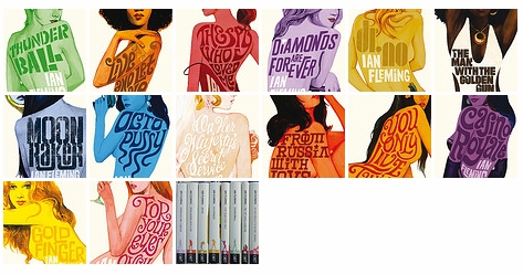
The new Bond covers from Penguin are gorgeous:
archive for the Design category
Edinburgh Council have a “Citizen’s Account” area on their website. I registered so that I could view and pay my council tax bills online. The process had been surprisingly painless until I came to add my council tax account number. I was presented with this stellar piece of form design:

Ignoring the incredibly sloppy layout bugs, it doesn’t look so bad, until you actually read the text:
Your account number is an 8 digit number which forms part of the 11 digit number to be found in the top right hand corner of your Council Tax demand. Please ignore the first digit and the last two digits of the 11 digit number. For example, if the number shown on your Council Tax demand is 91234567807, please enter 12345678.
(my emphasis)
Why, why, why are they making the user jump through hoops when entering a simple number? Why isn’t all this stupid number truncating done by the server? Entering an 11 digit account number (only once I notice) can be difficult enough without having to do a number puzzle on the data first. Council, you must try harder.

Good grief! Coudal’s photoshop tennis has returned! Now re-named as “Layer Tennis”. It feels like an awfully long time since the last one, and I’m certainly looking forward to Shaun Inman vs Kevin Cornell on friday.
Awesome. Reminds me of those diagrams in geography textbooks.
The unstoppably awesome moo.com have launched yet another incredibly nicely priced product line: Moo Stickers.
My logo design for the Open Street Map conference “State Of The Map” has been chosen as the favourite entry from the sea of other submissions (two). Apparently it’s going to be on tshirts and everything, how exciting! Unfortunately I can’t make the conference but I’ve recently been getting very enthused about Open Street Map. A couple of weeks ago I saw an Edlug talk by Chris Fleming and was inspired enough to go out and buy a GPS device. I got a Holux 236 pretty cheaply off ebay.com. It’s a tiny wee unit that has no display, but can communicate through usb or over bluetooth. So, I can run a java app on my mobile that connects to the Holux and receives the data stream automagically. It all Just Works, most of the time. Here is a random route that I’ve run through GPS Visualizer to get some KML that is then plotted on our old friend Google Maps.
The UK National Archives currently have a very nice online exhibition on the Art of War. It has quite a range of materials and includes decent sized quality images as well as ‘zoomable’ versions. All quite competently assembled! It also has a good range of the “comic” style art which would probably get called “pop art” these days. They remind me of Lichtenstein’s Whaam! which is hanging right over my desk as I type this.


Via Joe at the Forbidden Planet Blog.
Well, the Highland Fling is over!
It was a great day with very interesting speakers covering a great range subjects but centred around Web Standards and “Progressive Enhancement”. Progressive Enhancement (as I understood it) is the opposite to “Graceful Degradation”. If you plan your project with the bling included and then go back and undo the bling to provide functionality to less advantaged users (Graceful Degradation) then 9 times out of 10 you won’t get the time/money to actually undo the bling. If, on the other hand you plan your project so that you get the core functionality working across the board and then add the bling, you’re much more likely to finish with a system accessible to all. This was the message I got from Norm from Yahoo’s talk. It’s a shame he had such a bad throat, he could barely talk!
Some other good speakers were:
The intro by Jeremy Keith – an excellent speaker and drew lots of parallels with literature such as Pattern Recogniton and Neuromancer. Props!
Andy Budd’s talk on the future of CSS was exciting but about the only thing widely supported in CSS3 currently seems to be the opacity elememt. Other interesting elements that will be supported eventually are border-radius for rounded corners and box-shadow for drop shadows. The Advanced Layout module looks like it will blow the current css layout methods out of the water with it’s grid system for layout and re-ordering of the content. Slightly dis-heartening was Andy’s complaints about the workings of the CSS Working Group: the snail-like pace it operates and the possible influence of Big Business on it’s decisions.
Drew McLellan’s talk on Microformats was a bit dry but still good to see them getting pimped.
James Edwards came across as the Grumpy Man of Web Standards with a talk about when to use Ajax (never, if he had his way). He had a point though, and hopefully people will take notice and not just do Ajax for the sake of it.
Andy Clarke ended the day with a nice chatty presentation about what exactly “Progressive” enhancement is, relating it to progressive in the music world. Some interesting anecdotes from the world of freelance designers including a snippet from this standard contract that explicitly lists the browsers a site will be compatible. Also very nicely designed slides, as you’d expect really. Andy also sits on the CSS Working Group as some kind of invited member, he talked of his frustrations with the slow process but also made good points that the working group has to consider not just CSS used for screen rendering and the can of worms that internationalisation is.
There are people I’ve missed and lots of stuff I’ve forgotten already but there are lots of others writing about the Fling. Where do I sign up for next year?
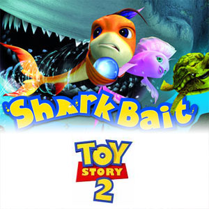
Hey The Reef! (or Shark Bait as it’s known in the US) Toy Story called, yeah, they want their font back.
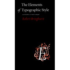
I finally got my copy of The Elements of Typographic Style by Robert Bringhurst from Amazon. As part of my new year resolutions I’m on a quest to learn something about typography. I must layout text on a web page every day at work at I’d like to know how to do it properly, and therefore improving the value of the page. After reading around on the web this book seems to be the bible and is very nicely designed and looks to be pretty readable. There’s even some chap doing an online version with Bringhurt’s typographic guidelines ‘Applied to the Web’. If you’re going to buy it online make sure you get the latest edition (3.1), which wasn’t immediately findable on amazon uk.
Via Tech Crunch UK I’ve started using a new web service called Stikkit. It’s basically just online post-it notes, very similar to the Stickies application in OS X. I’ve been wanting something like this for a while, google do calendars and mail very well, there are todo lists from 37signals but no generic note taking application. Stikkit is quite clever, as you’re writing a note it tries to calculate whether it is a todo list or an event, depending on the wording you use. So, writing “Buy beer for party on Friday at 8pm” automatically creates a event with the correct date and time. One immediate use I see for this is to quickly add things to google calendar. Just add your events through Stikkit and then show the event RSS feed on your google calendar. Creating “stikkits” is made super easy with a nifty bookmarklet that opens a wee AJAX powered window on your current webpage for data entry.
There are a lot more nifty feature but John “Markdown” Gruber has a very good review on his blog. I’d agree with him about the icons, I really didn’t know what most were going to do when I pressed them.
I’ve just checked out the waterstones website after noticing an ad in todays Metro. This new site is a reversal of their online strategy as previously the site was run as a glorified amazon affiliate. It was basically just a mirror of amazon’s book site with a waterstones logo at the top.
This new site is much nicer. It has a fresh and clean style and even has a few trendy curved boxes. The styled form elements look a little like a flash app but help to tie together the overall style. Doing a quick comparison the pricing seems competitive and the shipping is marginally cheaper. The threshold for free shipping is the same as amazon (£15) but amazon’s free shipping is “Super Saver” i.e. slow. It’s nice to see that they’ve improved the events and local store information (something which amazon did terribly) and that bookseller reviews are intergrated with product descriptions. The much talked about blogs are a little on the shonky side with no RSS and no visible actual blog-like structure.
Overall though, a vast improvement on the previous incarnation.
Disclaimer: I used to work at waterstones
I keep seeing this on vans around Edinburgh and every time it catches my eye. OK, it’s not creative genius but I like it.

Over on the Creative Review blog they’re discussing the new BBC One idents, those short clips they show between programmes and announce the next one. One thing I didn’t realise is that the font has also changed. They had a bespoke typespace designed by Fontsmith which, I think, is rather nice:
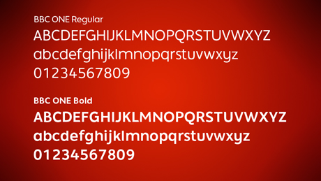
It is neat but not too restrained. Slightly playful, yet still has a corporate edge.
Very clever rugs that either have tractor tracks across them (the green one) or little animal footprints (the white one). I want one, but I imagine they aren’t cheap!
So I finally got bored of tweaking my re-design and just decided to stick it online. Still got lots of bits to tidy up…
Update: So I’ve tidied it up a bit. Made the logo clickable, added the old design to the design archives, updated the about page. Oh and yeah, it is a bit web 2.0 ain’t it? I think its the cheesey reflection under the logo. I should probably have mentioned earlier that I now have embedded hReviews for my ‘review’ type posts along with linked hCard.
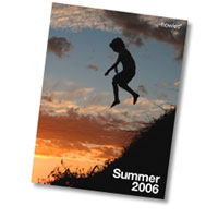
We got a super early copy of the new summer Howies catalogue through the door last week and I see that they’ve now re-designed their website.
The website is a nice subtle improvement on the old, mainly just navigation tweaks and even more fantastic photos from what I can remember. They’ve got some very nice looking t-shirts and tops but I should really resist spending more money this month :).
So I notice that flickr have had an interface re-design away from using bits of flash and into the oh so fashionable realm of AJAX. The drop-down menus at the top remind me a little of the Office 97 menus which (back then) totally destroyed the idea that Microsoft have any kind of UI guidlines or consistency. But hey, its all good. Even more things happen instantly with out a page load, the new organizr is a work of art and the new user inspector popup thing is way cool.
Last week whilst on a Flickr uploading spree of my Beltane photos I hit the free account photo set limit and bought a Pro account, it was just too easy, and they took paypal. My grand scheme (aside from the volcano lair) is to make Edinburgh Urban Art (currently languishing in ‘forgotten’ land) a super-awesome front end onto flickr using the API. I’m not even sure what I want is possible with the API but any kind of easy user collaboration will be better than its current state. To start the ball rolling in this direction I’ve founded an Edinburgh Street Art group to collate all the fantastic stuff we see around the city. Get uploading!

Silliness aside, it is an extremely clever brand and logo. Just what we’ve been led to expect from Nintendo really 🙂
update: and the new wii website is just as purty as the logo!
I should have mentioned this earlier but James and Alex have been showing off their mad skills with a new design over at Google Sightseeing. I love the retro travel brochure feel and the dynamically generated customs stamp images, nice one guys.
Uh-oh, it’s ten dollar sale at threadless time. I’ve managed to restrain myself to three new shirts this time. But I did have a whole fifteen bucks worth of street points to use. Awesome.
Blimey! Dabs have gone all CSS, and have valid XHTML! They’re even displaying the W3C buttons in their footer. I can’t think of another sizeable e-commerce operation that does that. Good on ’em!

I know I’m becoming a total mac-geek when I like t-shirts with mac GUI widgets on them. At work I use a mac while at home I’m in PC/Windows land. I have to say, there are more elements of OS X that I’d like in Windows rather than vice-versa.
The shopping cart system over on panic.com is also awesomely cool and the UI is instantly useable to mac users.
Typetester – Compare fonts for the screen, nifty stuff and super useful when creating new text styles for a site.
One of the guys at work had a copy of the new look Guardian in its Berliner format. It’s a really nice size, bigger than a scrappy tabloid, but smaller than a full-on broadsheet.
Their new overall look is very clean and modern, and the Guardian already looked pretty contemporary. They’ve created a new font aswell “Guardian Egyptian” was is very slick.
The digital version, which is basically pdfs or jpegs and text, is also free until September 26th to tempt you to have a read.
I often scoff at these “Ten more CSS tricks you may not know” articles due to my supreme knowledge of all things (ha!). But, some of the tricks described in this article I didn’t know about, and number ten is genuinely useful (no, go look yourself).
They’ve gone all typographic and print-like. I love it!
Protopage is a brilliantly useable application of AJAX and Javascript. A useful application for non techy folks who want to create an instantly editable “links page” to set as a home page.
We did some “extreme” programming at work the other day and manged to re-design clan.com in a single day(ish). This wasn’t technically extreme programming but hey, it makes our geeky jobs sound much more active and well, eXtreme. It was nice change for the team to focus on a single project for a whole day.
SwankSigns is an ace site “dedicated to the art of mocking public works”. It’s basically a gallery of bizzare and funny signs from around the world, some of which I think (hope) have had a wee bit of photoshop tweaking.
We were moaning about the lack of CSS bug fixes in beta 1 of IE 7 at work the other day. Reading the IE blog on msdn it’s nice to see that they have actually fixed the majority of CSS bugs, but these will only be fixed in beta 2 for some reason. Lets just hope everyone upgrades.
Browsing through delicious popular links tonight I spotted this new forum software “Vanilla” which looks very, very nice. It’s very Apple inspired in design and looks to be on the same design-train (all aboard) as the chaps at 37 signals. It’s got some super neat features. Such as, in your profile page, instead of having a million different input fields for various obscure IM formats they just have a “Label & Value” system. You write a label and then assign it a value e.g. “Milk In My Tea? – Yes Please!” or “Favourite Colour – Yellow”. They’re a bit like Tags for blog posts, you can dream up any Labels you like. Vanilla in general seems a nicely thought out piece of software. Hopefully something will crop up that I can install it for :).
Thank you to everyone who clicked through my threadless links and bought something! Last week I had enough points for a free t-shirt and picked this beauty:


The Forestry Commission logo has been a favourite of mine for a while now. The simpleness of the overlapping trees is great, and the two different trees help to represent the range of trees the commission must look after. It is also remarkably similar to the Ordnance Survey symbols for forests (shown left).
Great article by John Oxton on the current web design fashions. I was toying with using some of those “special offer” stars on the site here somewhere :).
Amazing “future-Russia” designs for uber communist buildings. A strange look at what could have been had it not all fallen apart: http://www.muar.ru/ve/2003/moscow/.
“Lorem Ipsum” is dummy text that designers use to fill text spaces on a page. It looks like pseudo-latin and allows you to layout a page with instant realistic content. Here’s an example:
Lorem ipsum dolor sit amet, consectetuer adipiscing elit. Vestibulum hendrerit, felis nec rhoncus ultrices, velit purus scelerisque ligula, a mattis quam risus eget elit. Proin nec purus sit amet leo fringilla mattis. Nam pede lacus, lacinia et, mollis a, bibendum et, sapien. Mauris sagittis tempus arcu. Nullam cursus metus a sem. Mauris eros nisl, imperdiet eget, nonummy ut, suscipit ut, lectus. Nunc sit amet dolor nec orci volutpat porta. Quisque rutrum lectus at purus. Mauris nulla lacus, imperdiet et, faucibus ut, consectetuer sed, leo.
From lipsum.com. Someone has come up with a few alternatives, including “techno babble” which is just great 🙂

I picked up the latest Banksy book on Saturday and it’s great! It covers all his latest ‘installations’ and his gallery targetting that I blogged about earlier.
Picturesonwalls.com which sells lots of his stuff has unfortunately sold out, but you can still get it on amazon.
Really, really cute and well designed pixel and tiling pattern website. It even calls the pattern section ‘table cloths’ on the site, very cute.
I’ve been thinking about some adding some kind of background pattern on here and some of those would be ideal.
I found this interesting site on current Edinburgh architecture and future planning for new buildings. The image above is of the new “Connery” filmhouse which is re-locating to Festival Square. It will certainly be very different once that is built.

A while ago in my role as “webmonkey” for GameSoc I thought that we were due a re-design. The site design had been unchanged for atleast a year and was starting to look rather dated. It was based around a horrendous table layout with a huge banner graphic. Really old-skool stuff. So, I’ve updated the colour scheme and stripped out some of the table layouts. A lot of the table stuff is still there but I really don’t fancy digging around in 30+ files changing <td>s and <tr></tr>s to <div>s and <span>s. The original site back-end code was written before CSS layouts were vogue. I think I’ll phase out the tables gradually.
I’ve also managed to crowbar in some nifty png image trickery. The shadows on the sides of the page content are actually pngs with variable transparency. This means the background image can change and the shadow will still ‘make sense’. Neato stuff, except that is totally breaks in IE (surprise). One hack later and IE is atleast displaying the image properly. But now you can’t click on any of the page! Slight flaw there microsoft… Another google later and I find this life-saving page. Apparently your image has to be really small in one of it’s dimensions. That’s one nasty bug.
Anyway, I like the new look and I’ll continue squashing those nasty tables. What do you think?
