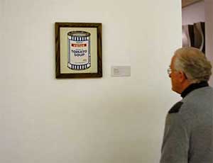
Some snaps of paintings that (the genius that is) Banksy snuck into various New York art galleries. Great stuff 🙂
Some snaps of paintings that (the genius that is) Banksy snuck into various New York art galleries. Great stuff 🙂
I was wandering around John Lewis last week and I noticed the really cool coasters:

A little bit periodic-table-like. They were rather expensive though so I thought I’d check online.
Unfortunately Half Moon Bay only do trade sales over the ‘net. While I was browsing their online catalogue I did notice this really funky NYC door mat:

…and this “lollertastic” pack of chewing gum which Kerry actually got me last christmas! (So thats where she got them from…)

Threadless have one of their fantastic $10 annual sales on at the moment. So Kerry and I have stocked up with a mega-order:


Even with $25 of postage it still works out so much better than buying shirts in the UK. Gotta love the current $ to £ exchange rate!
There are some neat interface design tips over on my current fave 37signals.
There is a fascinating and informative history of multimedia and ‘interactive design’ over on smackerel.net. It’s written by some guys who’ve been around since the birth of the mac and really, really know their stuff.
Both sixapart.com and moveabletype.org have had a re-vamp. A lot less cluttered and much easier to read. These rounded boxes seem to be getting very popular aswell, I’m seeing them everywhere.
One blog that caught my eye as I was browsing the 2005 bloggies entries was SimpleBits. The design is very, very nice. It’s pixelly, very tight and precise and I love the colour scheme. I think I need more icons on the site here, another thing to do when I’m feeling better.
A while ago Alex pointed me to this site about how to make your own cute pixel objects. I messed around a bit and came up with this:

Hey, it’s a start! It also came to me that you could write code to do this for you. Some kind of php module with methods like:
pixelcube(dim_x,dim_y,colour);
You could have a pixel objects graphics library with all the basic primitives like cube, sphere etc. Hrm.
So, after my marathon post below about new search engine features, A9 have come out with a new Yellow Pages function. They went around some of the major cities in the US taking photos of all the shop fronts on either side of the streets. Then, when you search for a business you get an actual picture of the shop frontage. You can even ‘walk’ down the street by flicking along the pictures. All very cool.
Some has hacked it already (of course) so you can grab a view of an entire street. Nice.
And then a9 pay to get a shamelss plug into the OC, someone actually uses the phrase “a9.com-ed”. Doesn’t quite work aswell as “googled” 🙂
All the companies playing catchup to Google have recently brought out new interfaces to their engines. Google have been a staunch follower of the simplistic design approach with a minimalist front page and adverts that are incredibly unobtrusive when compared to their competitors. The competitors have obviously taken note that users maybe actually like looking at nice things and not some mess of animated red/black/purple blinking/scrolling/fading in 20 boxes all packed together on the page.
I’ve always been an admirer of design company 37signals. They have an incredible uncluttered and useable design style. The thing that made me notice them was their ’37better’ project where they redesigned some common websites themselves. They’ve also got a host of very cute projects like Ta-Da Lists, an online task list mananger and their fully-fledged project manager BaseCamp. Such good project names 🙂
Every now and again I get the feeling I’ve seen all the cool (i.e. I think is cool) stuff on the net. When I find sites like this I realise how dumb thinking I’ve seen everything is, there’s always something else out there.
Chris Justus has dissected the Google Suggest Javascript code that I blogged about earlier. It’s very cool stuff, it uses an embedded http-xml component to communicate with google’s servers as you type. The results are then displayed dynamically with some clever javascript key handlers to help navigation. I first read about Google Suggest over on the Google Blog, where it started as one guys personal project. At google they’re allowed to spend 20% of their time at work on any project they choose. That is so cool.
Firefox have at last released verion one of their fantastic browser. They also raised the funds to have a full page, full colour ad in the New York Times basically telling people that IE is rubbish and that they should switch. I like their style. Go! Download it now!
Froogle have recently launched in the UK and at work we’ve hopped on the bandwagon with me developing a froogle feed backend. You can view all of our products here or one of my favourite products here. Now….its party time.
Lloyds have re-designed their web presence and finally moved away from the very clunky table fest that is was before. It’s totally css and not a table in site now, nice. Not sure if I like the actual layout though, there is an awful lot of white space at the top and it never seems to quite fit on the “first scroll” of my browser.
A while ago at work my colleague Alex discovered something in css that none of us knew.
When assigning a class to a div like so:
<div class="blah">...</div>
You can choose more than one class:
<div class="blah anotherclass andanotherclass">...</div>
This is incredibly helpful at times. I even used it in the re-design of the site here. The rollover images down at the bottom use this technique. There is a generic class that does the rollover background image changes and then more specific classes so that the image to use can be specified. Neato stuff.
Woo! It’s FireFox update day! I’m lovin’ the new features in 1.0PR like the rss integration, tweaked theme, faster UI, etc. It’s just so much better than Internet Explorer I don’t know where to start. If you haven’t switched, do so now.
If you’re looking for an Outlook alternative there is also FireFox’s sister project Thunderbird . This became my preferred news client after Outlook drove me up the wall with its incessant crashing and generally being lame and un-responsive.
Adam is back in Edinburgh after his industrial placement at Rolls-Royce. He’s finally had time to do a re-design of his site and has gone for the “oh so cool” photo at top. I hear it’s what all the cool kids are doing…
Mozilla have had a bit of a re-design. I like it.
Looks like the free .info domains offer wasn’t a scam. Amazing. I now have :
cyber-junky.info
ojackson.info
oliverjackson.info
ollyj.info
ollyjackson.info
all pointing at cyber-junky.co.uk.
Pretty sweet, if a little pointless 😉
This place is doing free .info domain registrations. There doesn’t seem to be a limit on how many you can register either. No doubt there is a catch somewhere but I regged about ten just now to see how it goes. http://ollyjackson.info and http://oliverjackson.info could be live sometime tomorrow.
Work is pretty constant at the moment with lots of design “look n feel” changes on our main store. We finally managed to drag www.scotwebshops.com kicking and screaming out of html 4 hell. It took some convincing as it wasn’t a “critical” project but we managed it in the end :).
Not to jump on the bandwagon with this no-www thing, but I’ve not been using the ‘www’ bit of my domain for years. It always did seem a bit silly. My browser browses the World Wide Web, why should I have to put www in front of every domain name? Chopping the ‘www’ off makes sense. I remember back in the day when a few sites obviously discovered the magic of dns suddently had ‘www2‘ in their domain. We were amazed! “Is this the second, secret internet??”.
Firefox is the best browser out at the moment. If you’re still using Internet Explorer, stop, now. Browsing around their site yesterday I found they had a new release out which fixes a couple of bugs. They don’t seem to announce the 0.0.1 releases which is strange. It’s now on 0.9.2 and has nicely funked up icons. Whilst I was there I noticed the increasing selection of Extensions. Extensions are a genius feature where developers can extend the functionality without reinventing the wheel. I’ve now get a spellchecker installed and the very useful Web Developer plugin.
Interesting article on Wired about designers who redesign other companies inaccessible websites.
All very topical at the moment after the morons at Odeon closed down the Accessible Odeon site.
Coudal Partners were always very slick and their latest redesign is particularly tasty:
Coudal Partners
I was clicking around the new version of EUSA’s website and noticed they had a text-only mode that looked very similar to the bbc’s text-only mode. After digging a bit deeper I realised that the bbc actually released the source to the parsing engine for creating their text-only pages. How nice is that? This is just the thing I need for the project I’m working on at the moment. I was going to make an alternate “highly accessible” style-sheet. But this is a much more elegant solution.
My good buddy Joe has has a jolly nice revamp of his very well written blog. The Woolamaloo Gazette, check it out.
Been avoiding proper uni works lots lately so I’ve been working on the GameSoc website. I’m now officially the webmaster, we had a proper AGM and everything. Its really fun getting stuck into a nice project, even if some of the code is 3rd-hand and completely unreadable. I’ve fixed a few niggling bugs and added some nifty new features which will not interest you in the slightest if you aren’t a member.
Thanks to brad for pointing out that A List Apart is back up with v3 of their site. A cracking bunch of new articles aswell, the css image tabs are pretty amazing. Check it out.
The official webpage of the North Korean ‘government’ is the ultimate in communist-chic. Its just bizzre seeing stuff like this on the web. It all looks like Russian posters from the 60s, smiling workers and the omni-prescient ‘leader’.
The e-library is of particular comedy/worrying value.
Oh and they seem to love image maps.
Did some updating of a-mackenzie.co.uk the other day and tweaked the main interface this morning. Quite happy with the result aswell.
The bbc news site has redsigned and tweaked a few things. I have to say, its an improvement, the page is now a decent width and you don’t have to scroll all the time.
Can’t wait to see what they come up with. news.bbc.co.uk is one of the most useable sites around in my opinion.
BBC NEWS | UK | News Online to get a new look