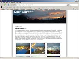
What do you think?
Its a bit plain at the moment, but I’m lovin’ the fixed-width centred column look. I really want a largish image on there somewhere (with my own photos) and some nice vertical scrolling for the blog text. I may try moving away from shades of grey (gasp!). Basically I just want cyber-junky to be my blog and then I’ve got a separate portfolio site in the works. I’ve also got to put some effort into the ninjahosting site and finish the “ninja gallery” that Alex, Ian and I are supposed to be developing.

Very nice Olly. Drop shadow ahoy!
Some navigation on the bottom right of the top photo might be nice. In white.
Brad - July 15th, 2004 @ 11:30 amI’m mostly in favour, with obligatory “somewhat broken in Opera” reservations.
Yak - July 16th, 2004 @ 6:18 pm